How the grid works
The layout is based on a 6-column grid. Each width maps to a specific column span: Full width = 12, 1/2 = 6, 1/3 = 4, 2/3 = 8, 1/4 = 3. On smaller screens, columns stack automatically so your SOPs stay legible.
Example
Full width (12/12)
Ideal for step headings, hero images, safety warnings, or long text. In the grid this is simply the default setting, Full width
Half width (1/2)
Use 1/2. Great for pairing an image with a short instruction or for side-by-side checklists.
Half width (1/2)
Combine two halves for symmetry. This pattern works well for "Do / Don't" examples or parallel process paths.
One third (1/3)
Use 1/3. Good for a compact photo, icon list, or KPI card.
Two thirds (2/3)
Use 2/3. Pair with a 1/3 block to present an explanation next to a visual.
Two thirds (2/3)
Use 2/3. Pair with a 1/3 block to present an explanation next to a visual.
One third (1/3)
Use 1/3. Good for a compact photo, icon list, or KPI card.
Quarter (1/4)
1/4. Perfect for short steps, tool lists, or quick safety reminders.
Quarter (1/4)
Stack four quarters to create a compact dashboard of steps or resources.
Quarter (1/4)
Quarters remain readable on mobile because they stack to full width automatically.
Quarter (1/4)
Use consistent headings and short paragraphs to keep scanning effortless.
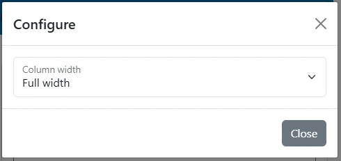
Set element width via the gear icon
When you add a new element to a work instruction, click the gear icon on that element to choose how wide it should be. The Work Instruction App instantly applies the right grid classes and reflows the layout—no code needed.
Gear
1) Open layout options
Click the gear icon on the element you want to resize. This reveals width presets aligned to the grid.

2) Choose a preset
Select Full width, 1/2, 1/3, 2/3, or 1/4.
3) Save and reorder
Drag to reorder elements and fine-tune hierarchy. Use consistent headings and concise copy to improve scanability.
Width presets using the SOP grid system
| Preset | Columns (12-grid) | Typical use |
|---|---|---|
| Full width | 12 | Step titles, hero images, long explanations, safety notices |
| 1/2 | 6 | Two columns of balanced content; image + text pair |
| 1/3 | 4 | Small visuals, KPI cards, quick notes next to main content |
| 2/3 | 8 | Primary explanation next to a 1/3 support block |
| 1/4 | 3 | Four-up tiles for steps, tools, links or safety reminders |